Presence Status Redesign
I redesigned the GoTo app’s presence status experience inside the avatar menu to support a Do Not Disturb (DND) timer and make Auto-update more discoverable and easier to return to, so the upcoming Schedule feature could work reliably.
Company
GoTo: Business Communication & IT Support Software
Role
Lead UX researcher + designer
(supported by UX designer, Elise Pelchat, and UX researcher, Scott Webb)
Tools
Figma · Miro · UserTesting · Mixpanel
CONTEXT
How presence status worked initially
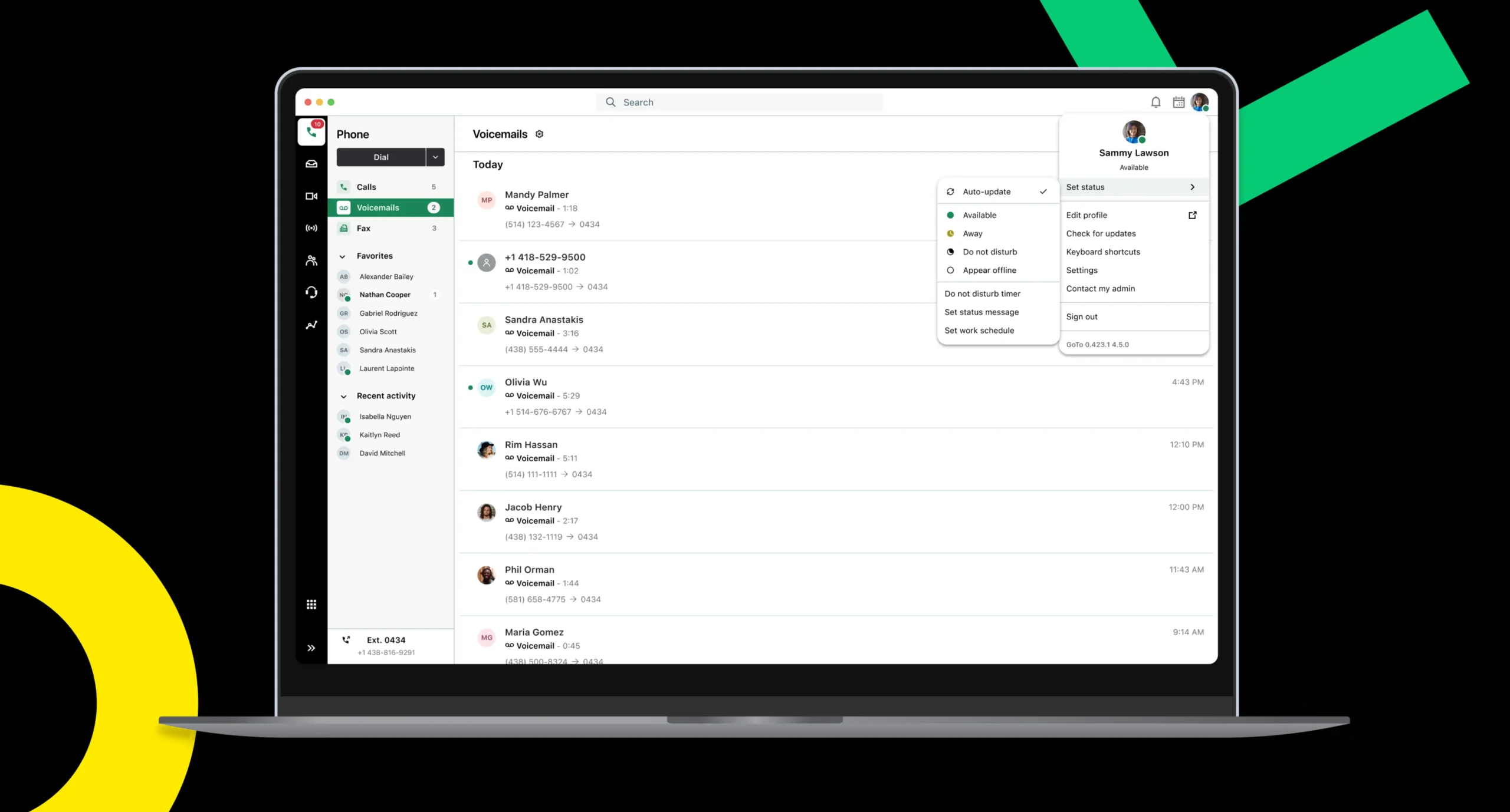
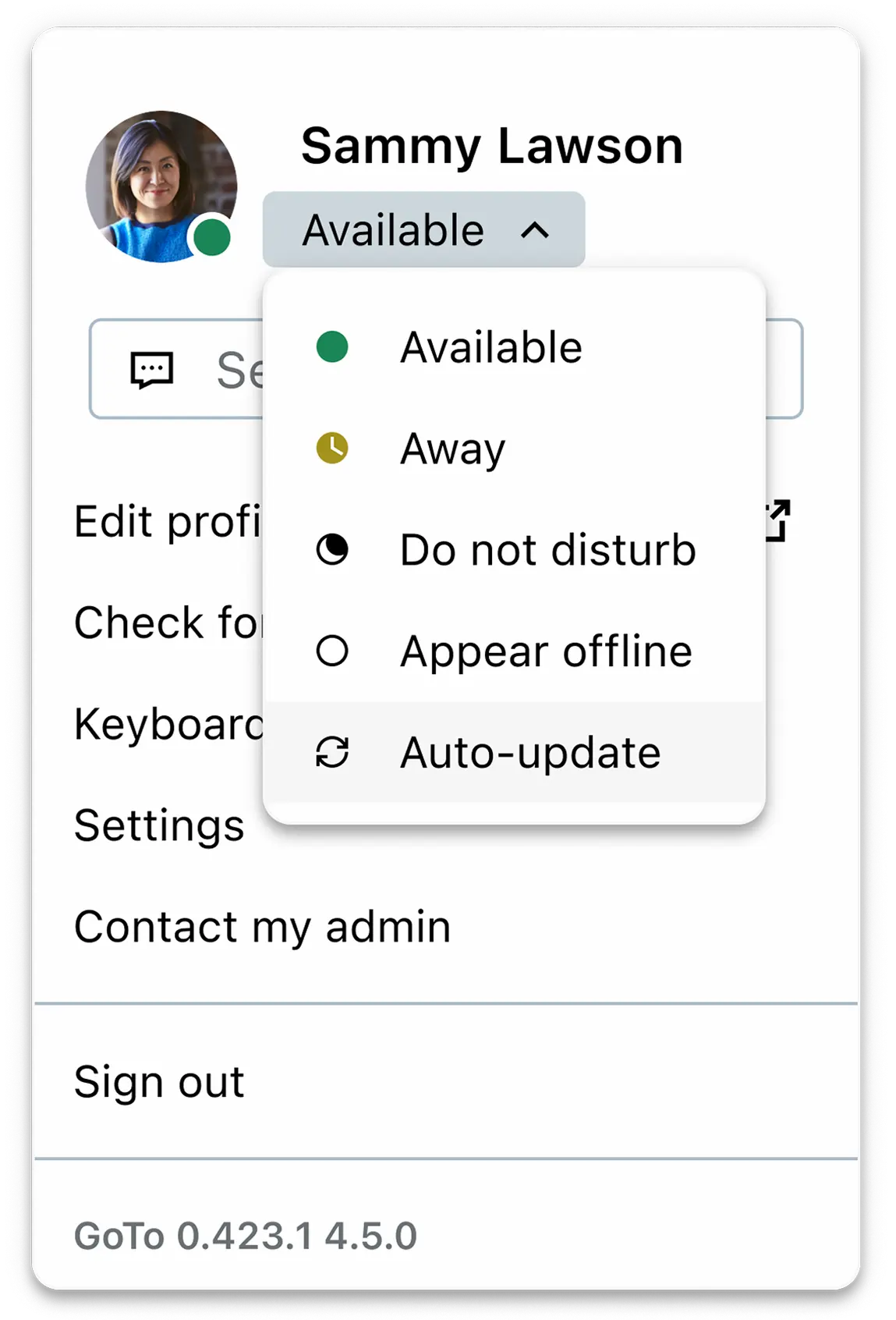
In the avatar menu, users could manually set their availability through a status selector (Available, Away, Busy, DND, Appear offline). The interaction was straightforward:
Open avatar menu
Choose a status
Return to work
Open avatar menu
Choose a status
Return to work
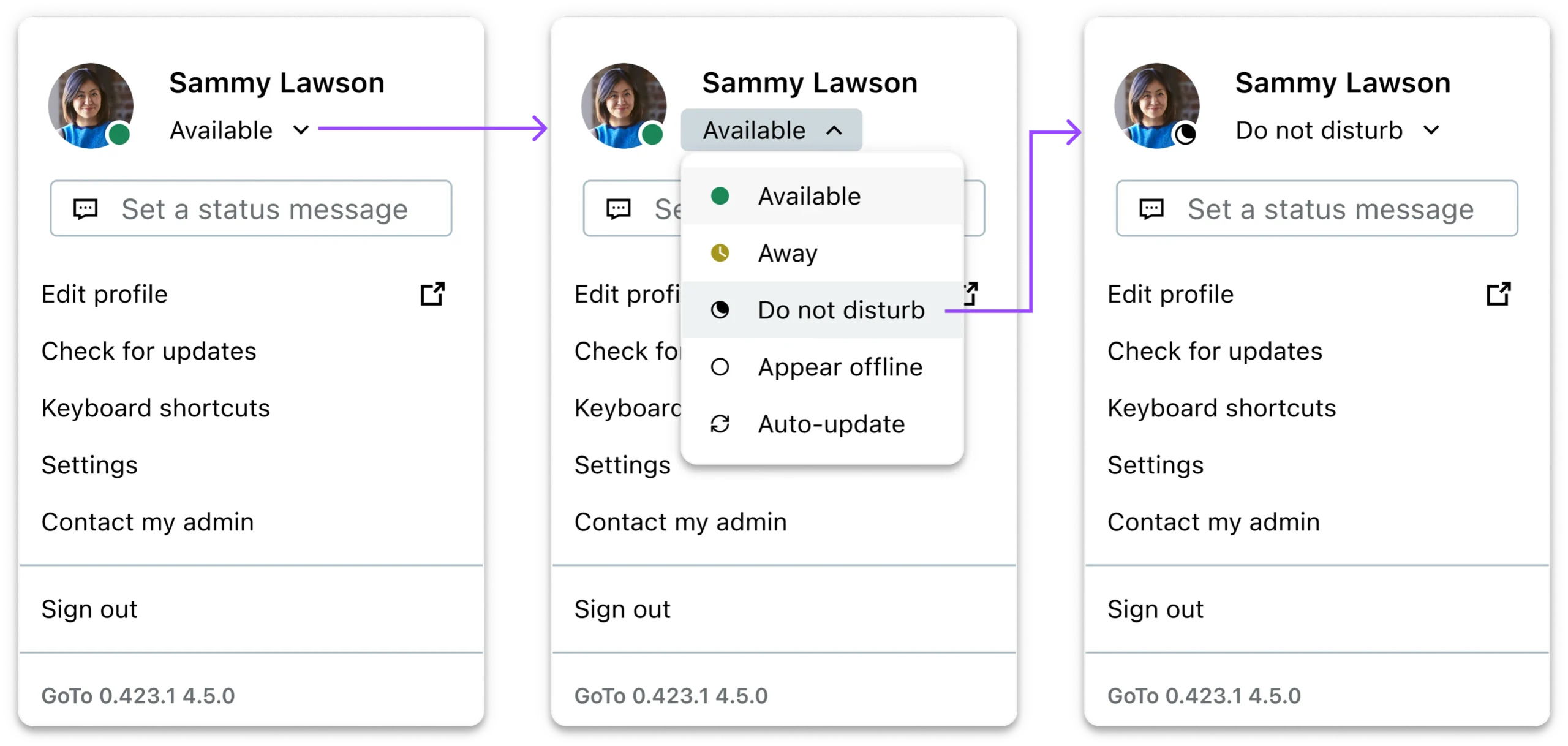
The original flow to set a status with “Auto-update” last in the list
What Auto-update means
Auto-update is a status mode that updates your status automatically based on signals like calendar events or whether you’re in a call. Instead of users remembering to toggle statuses throughout the day, the system keeps their presence accurate in the background.
Avatar menu with Auto-update status selected
Schedule and why this mattered
At the same time, my team was building a Settings feature called Schedule, designed to reduce manual status management. Schedule lets users define when they want calls and notifications by setting:
- Work hours: regular weekly availability (outside those hours, the app can set them to DND)
- Exceptions: custom blocks like holidays or quiet hours where they don’t want interruptions
CRITICAL DEPENDENCY
Schedule can only control availability when a user is set to Auto-update. If someone manually sets their status, that manual choice takes priority and Schedule can’t override it.
The original request was to add a DND duration. During that work, and stakeholder conversations, we surfaced a bigger product risk: Auto-update adoption was lower than expected, and many users were defaulting to manual statuses. If we shipped Schedule without addressing that behavior, users could set up a schedule and still get interrupted, because they were unknowingly “blocking” Schedule by staying in a manual status. That’s when the scope expanded from adding a timer to also improving how users discover and return to Auto-update.
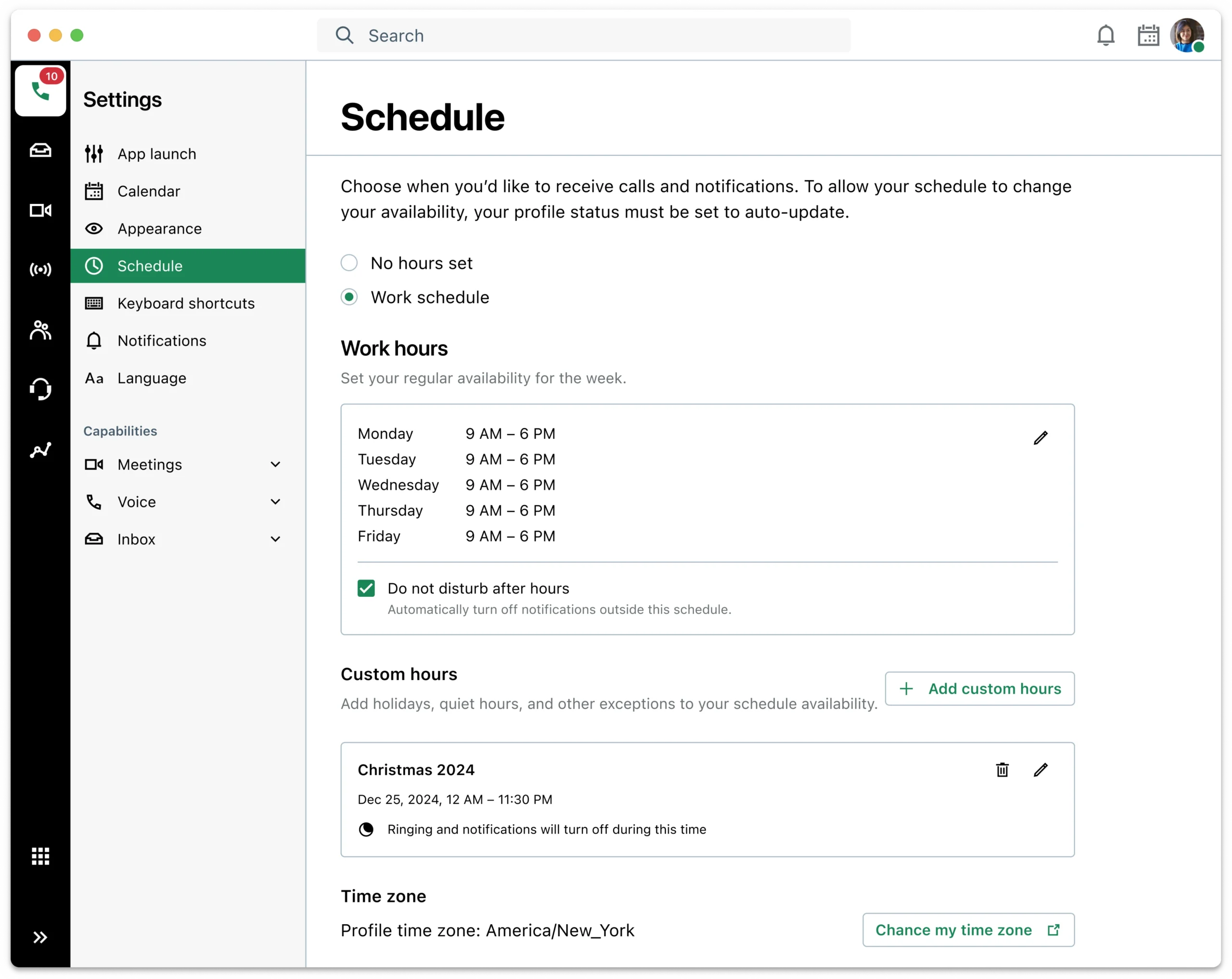
Schedule page in our settings
CONSTRAINTS
What I was working against
Design system limitation
Discoverability challenge
Localization
Menu density
COMPETITIVE SCAN
What others were doing
I reviewed how other platforms like Microsoft Teams, Zoom, and Slack handle timed availability to understand the common interaction patterns users are likely already familiar with, especially around setting a duration, seeing when it ends, and resetting early.
| Platform | Timed availability pattern | End-time visibility | Recovery / reset pattern |
|---|---|---|---|
| Microsoft Teams | Status menu includes a Duration control where users set a status and choose when it should reset (preset duration or custom time). | Users need to reopen the Duration control and see the selected option (not “time remaining”). | Status auto-resets after the duration; users can also change the status manually anytime. |
| Zoom | DND is always time-bound: users must choose a preset duration (20 min, 1 hr, etc.) or select Custom to set a DND time window via Settings → Notification preferences. | The active DND remaining time is shown directly in the status menu (e.g., “19min”). | Users can Turn off DND directly from the menu (end early). If DND came from a Custom time window, turning it off also disables that window and users must re-enable it in the Settings window for future use. |
| Slack | Frames this as notification control more than a presence status: users pause notifications for a timeframe or until a chosen time. | End-time (“paused until...”) is visible in the same control surface where it’s set/managed. | Auto-resumes notifications after the duration; there’s also a “Resume notifications” action (end early) built into the same place. |
DESIGN EXPLORATIONS
From focused scope to expanded problem
Round 1
DND timer patterns (before expanding scope)
I began with the original ask: let users set DND for a duration and make it easy to end early. I mocked up multiple approaches (placement, interaction style, time selection, and how the timer state is shown) to answer two questions:
How does a user set a timer quickly?
How does a user clear just the timer when they’re done early?
Early critique with other designers
I brought these early concepts to UX designers outside the project for fresh eyes. That critique helped eliminate risky directions quickly like:
- A 3-level menu that would make duration feel mandatory and heavy
- Long labels that wouldn't localize well
That feedback narrowed the field to a smaller set of viable patterns before we involved Engineering.
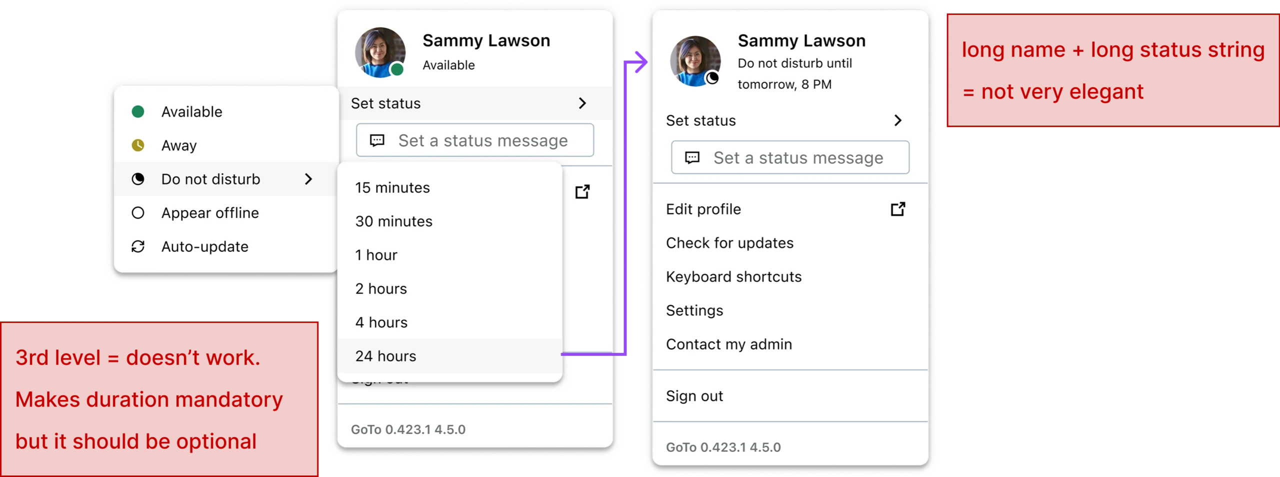
Examples of early explorations critiqued and eliminated
Stakeholder check (Product + Engineering)
I then reviewed the timer directions with the Product Owner and engineers to validate feasibility and edge cases (timer expiry behavior, state precedence, and menu density).
TURNING POINT
While aligning on the timer work, we surfaced low Auto-update adoption and the dependency for Schedule, so we intentionally expanded the redesign scope to also improve Auto-update discoverability and return-to-default behavior.
Round 2
DND timer + Auto-update return behavior
With the expanded goal set, I designed for three specific aspects (and mocked multiple options for each):
How a user sets a DND timer
I explored different entry points and control styles. (e.g., a dedicated timer action versus timer controls inside a “change status” flow)
How timer information is displayed
I explored where and how to show the end time so users don’t have to guess whether the timer is active. (e.g., tooltip vs visible inline text in the menu)
How to shift behavior back to Auto-update
This was the habit change problem: after someone chooses a manual status, how do we make “return to Auto-update” the natural next step?
After mocking up options for each aspect, I narrowed to a few promising approaches per aspect that needed real validation. Rather than testing every micro-variant, I assembled two end-to-end flows, each combining different choices across those three aspects, so I could see what actually worked in context and then combine the winners into a final design.
The two flows I built for testing
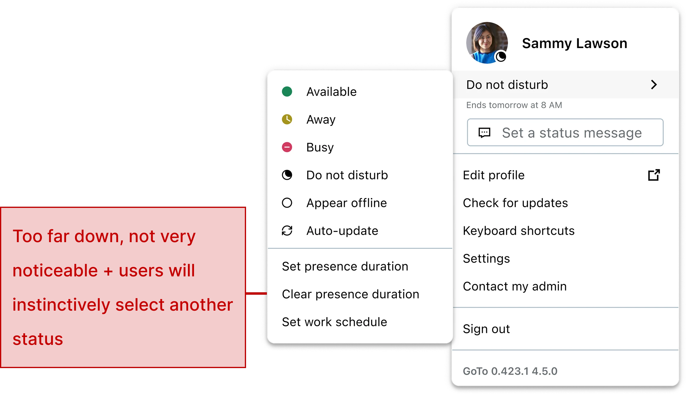
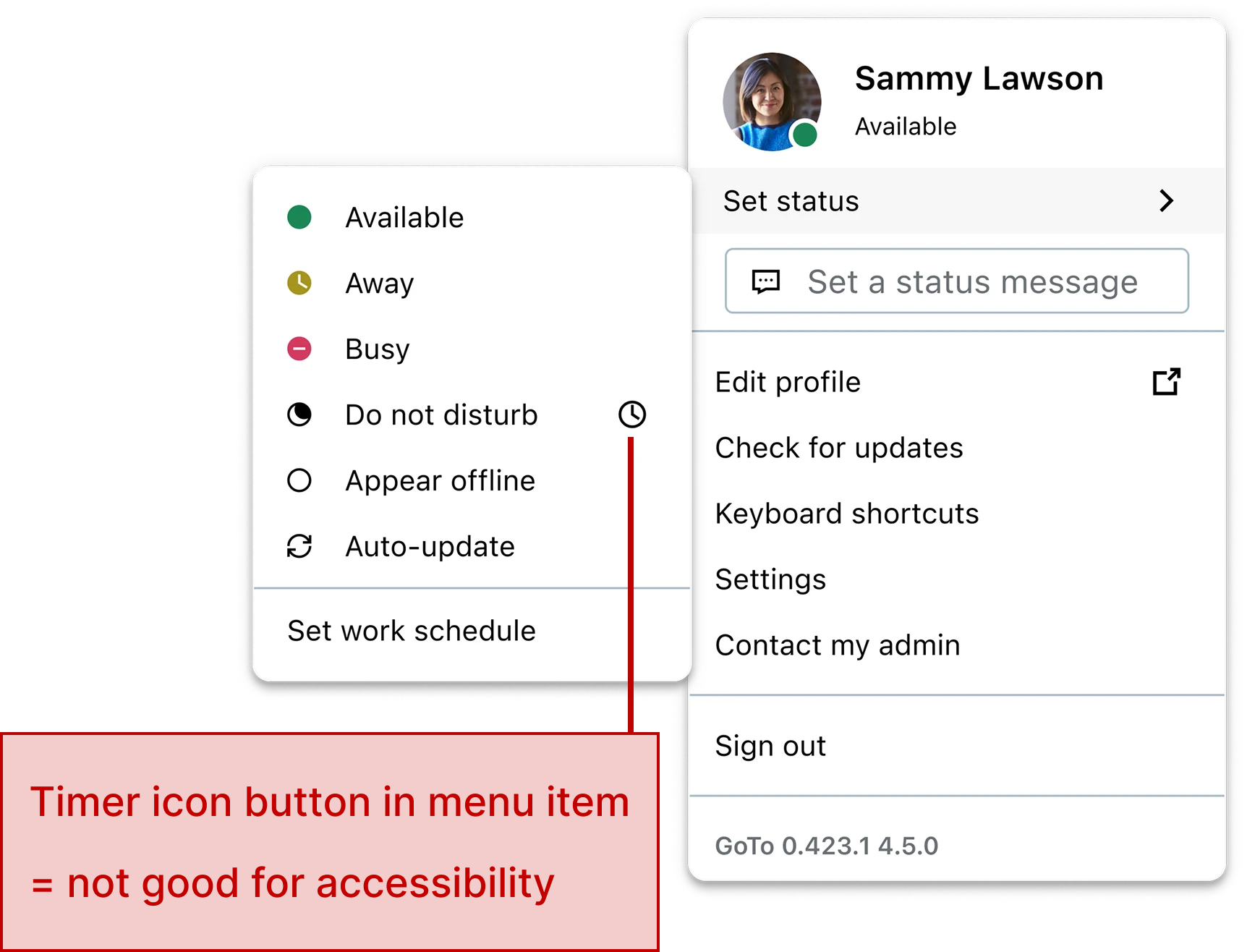
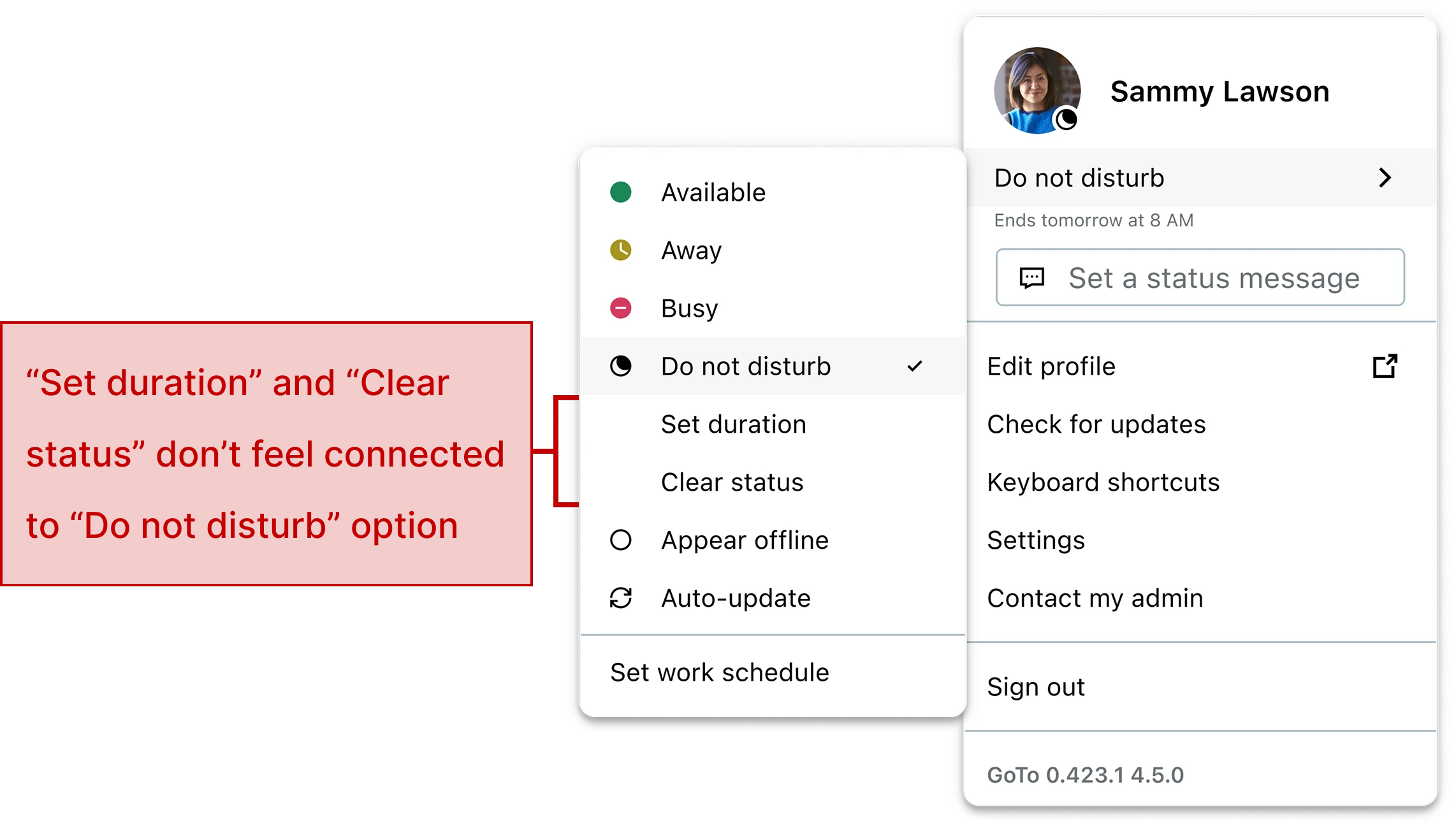
Design A
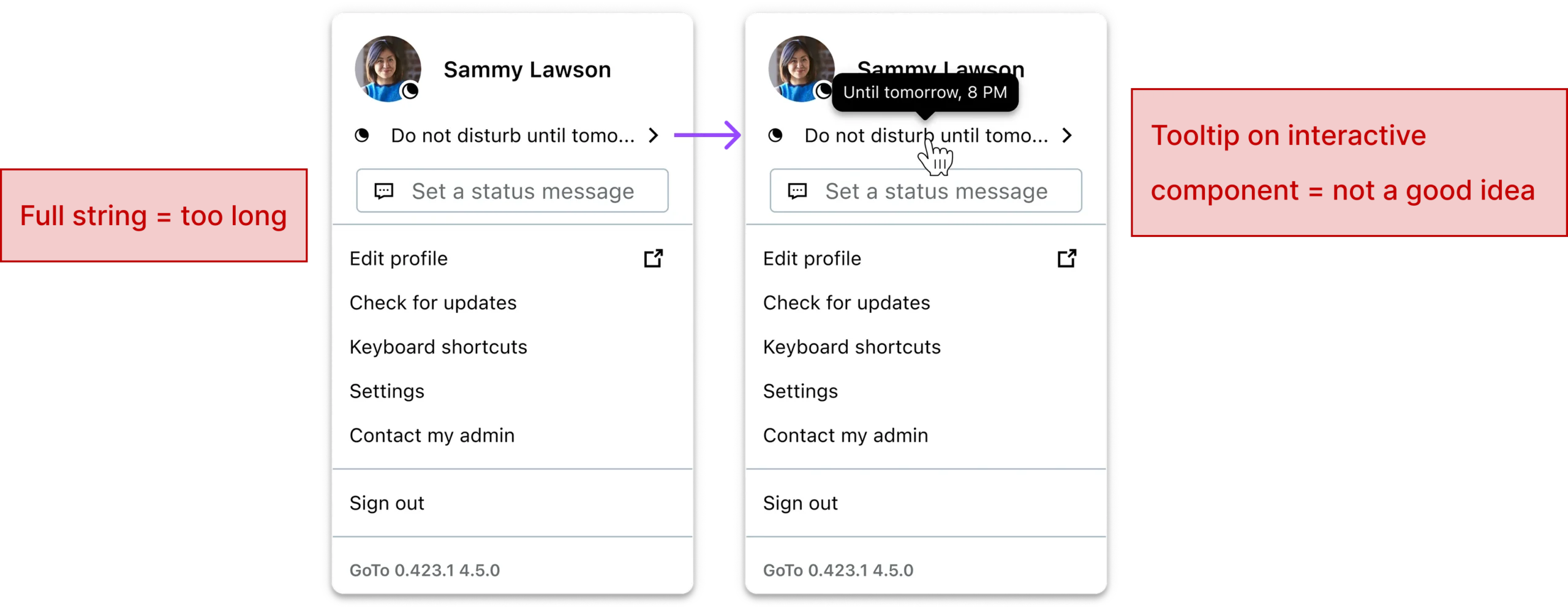
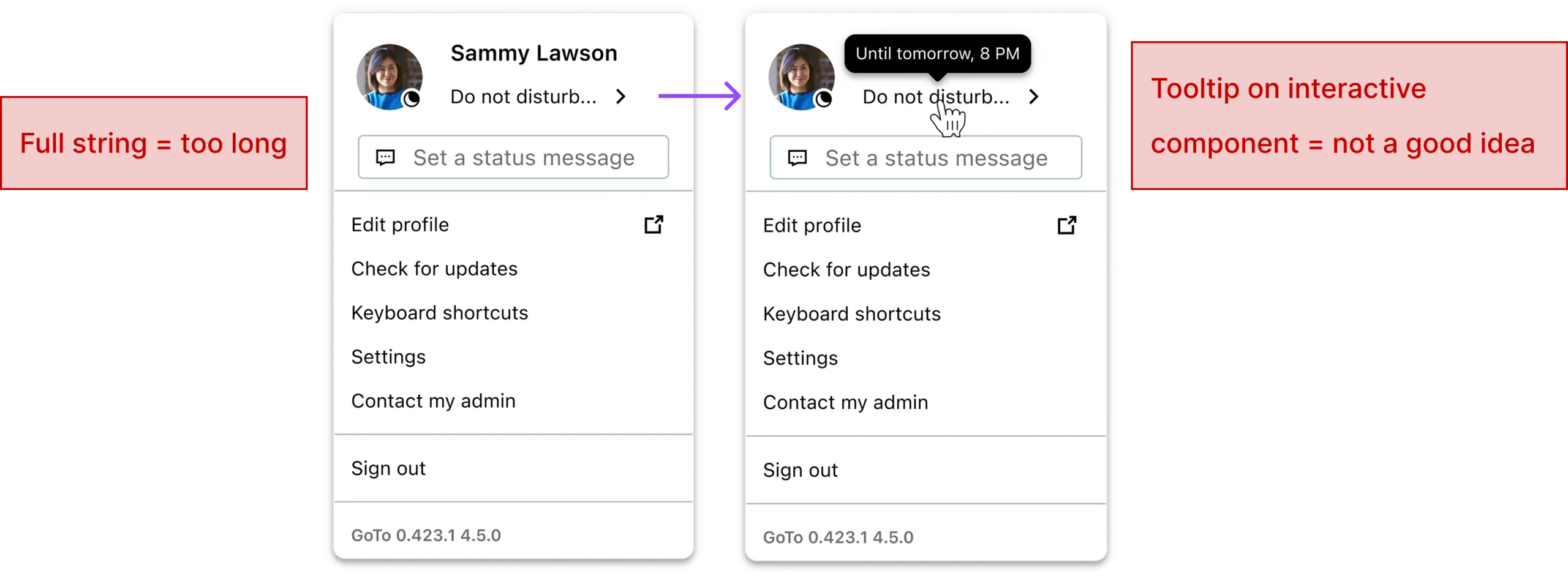
Submenu + tooltip + manual return to Auto-update
- The avatar menu contains a presence menu item that reflects the current status (e.g., it shows “Available” when you’re Available).
- Clicking it opens a submenu listing statuses, with Auto-update moved to the top (it had previously been last).
- The submenu includes “Set status duration”. Choosing it opens a modal where the user sets a DND duration and saves.
- After saving, the status switches to DND. The end time is available via a tooltip that appears when hovering the status icon on the user’s avatar.
- To return to Auto-update, users must manually select Auto-update in the submenu.
Flow to set a DND timer and check end time
Flow to get back to Auto-update
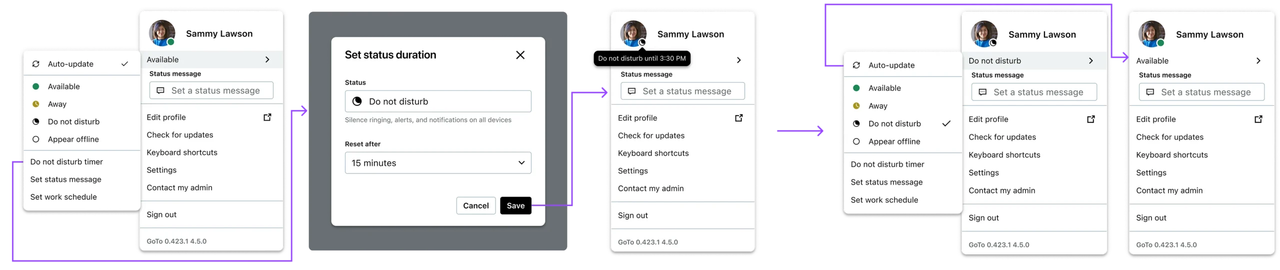
Design B
Change status modal + visible end time + Reset now
- The avatar menu shows a “Change status” button. Clicking it opens a modal.
- The modal includes a status dropdown; when Do not disturb is selected, a second dropdown appears: “Reset status after” (the timer).
- The modal also includes a status message field.
- After saving, the avatar menu shows “Resets at [time]” directly under the button and exposes a “Reset now” action.
- Reset now returns the user to Auto-update, and users can also return to Auto-update via Change status.
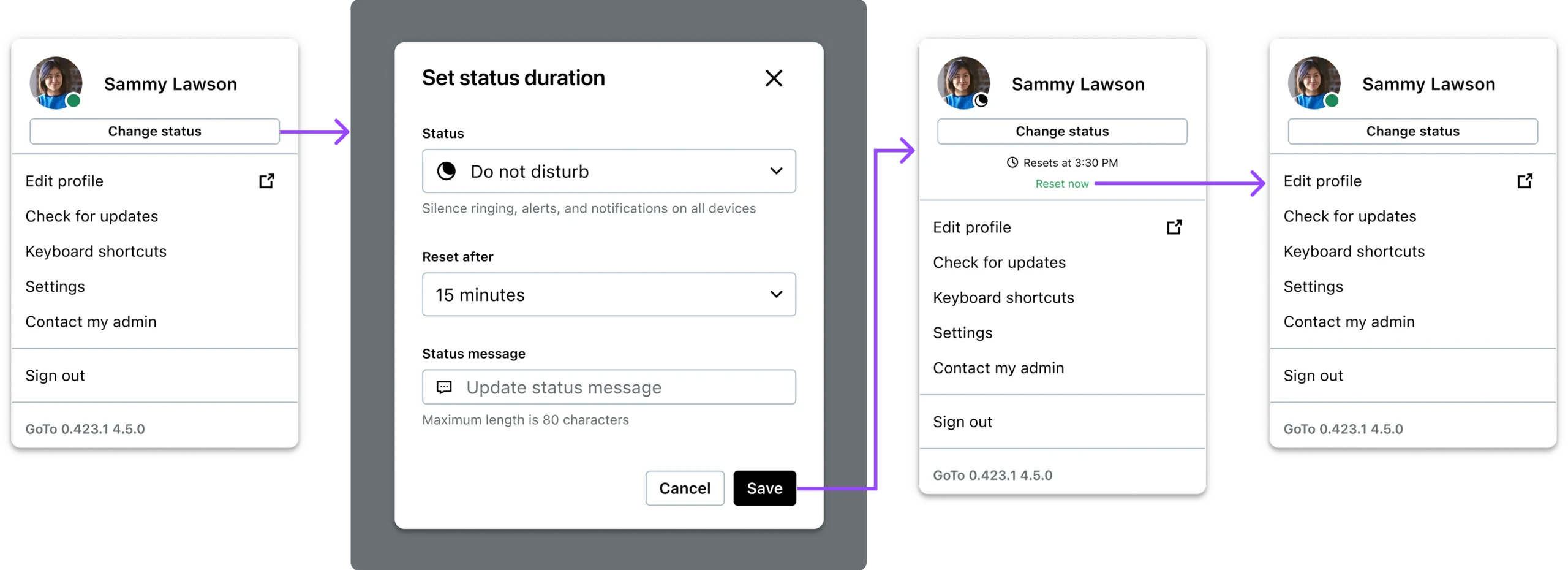
Flow to set a DND timer
Flow to get back to Auto-update
These two designs let us evaluate the same three aspects with real behavior: timer entry, timer visibility, and return-to-Auto-update behavior.
USER RESEARCH
How we validated through real behavior
To validate which presence-status flow performed better in real behavior, we ran an unmoderated usability test using a think-aloud protocol. We chose this format because presence changes are a habitual interaction. Think-aloud helps capture users’ expectations, points of hesitation, and decision cues in the moment, without a facilitator steering them.
10
PARTICIPANTS
“Look-alike customers”: managers, IT admins, and HR professionals representing general office workers.
3
KEY INTERACTIONS TESTED
Setting a DND timer, understanding when it ends, and returning to Auto-update after a manual override.
We used a counterbalanced A/B design to control for order and learning effects. This allowed us to compare the two interaction models more fairly and isolate what actually helped users achieve the key interactions.
5
PARTICIPANTS
Design A
Design B
5
PARTICIPANTS
Design B
Design A
Scripted task scenarios
Set “focus mode” for one hour (avoid interruptions)
End it early and return to receiving calls/msg
Show where they’d look to confirm when the timer ends
KEY FINDINGS
What we learned from testing
1
Tooltip-based disclosure failed discoverability
When the timer end time was only available on hover, participants often didn’t find it or didn’t think to look there. The interaction relied on an invisible affordance (hover) with no strong cue, so critical information stayed hidden.
2
Visibility of system status reduced uncertainty
In the design where the avatar menu displayed “Resets at [time]” directly after saving, participants immediately understood that a timer was active and when it would end. Making the end time visible in the primary UI (instead of buried) increased confidence and reduced the need to double-check elsewhere.
3
Auto-update wasn’t treated as the default recovery state
When participants wanted to “go back to normal,” they often chose a manual, predictable status (commonly Available) rather than returning to Auto-update. Having Auto-update as an option in the list wasn’t enough to make it the default behavior after an override.
4
A dedicated “Reset now/Clear status” action created a stronger habit cue back to Auto-update
When a one-click reset appeared immediately after users selected a manual status, it made the override feel temporary and encouraged a consistent behavior pattern: override → reset back to Auto-update. The visibility of the reset action acted as a timely prompt, which helped Auto-update become the natural default without forcing it.
SOLUTION
What we shipped
One place for status-related actions
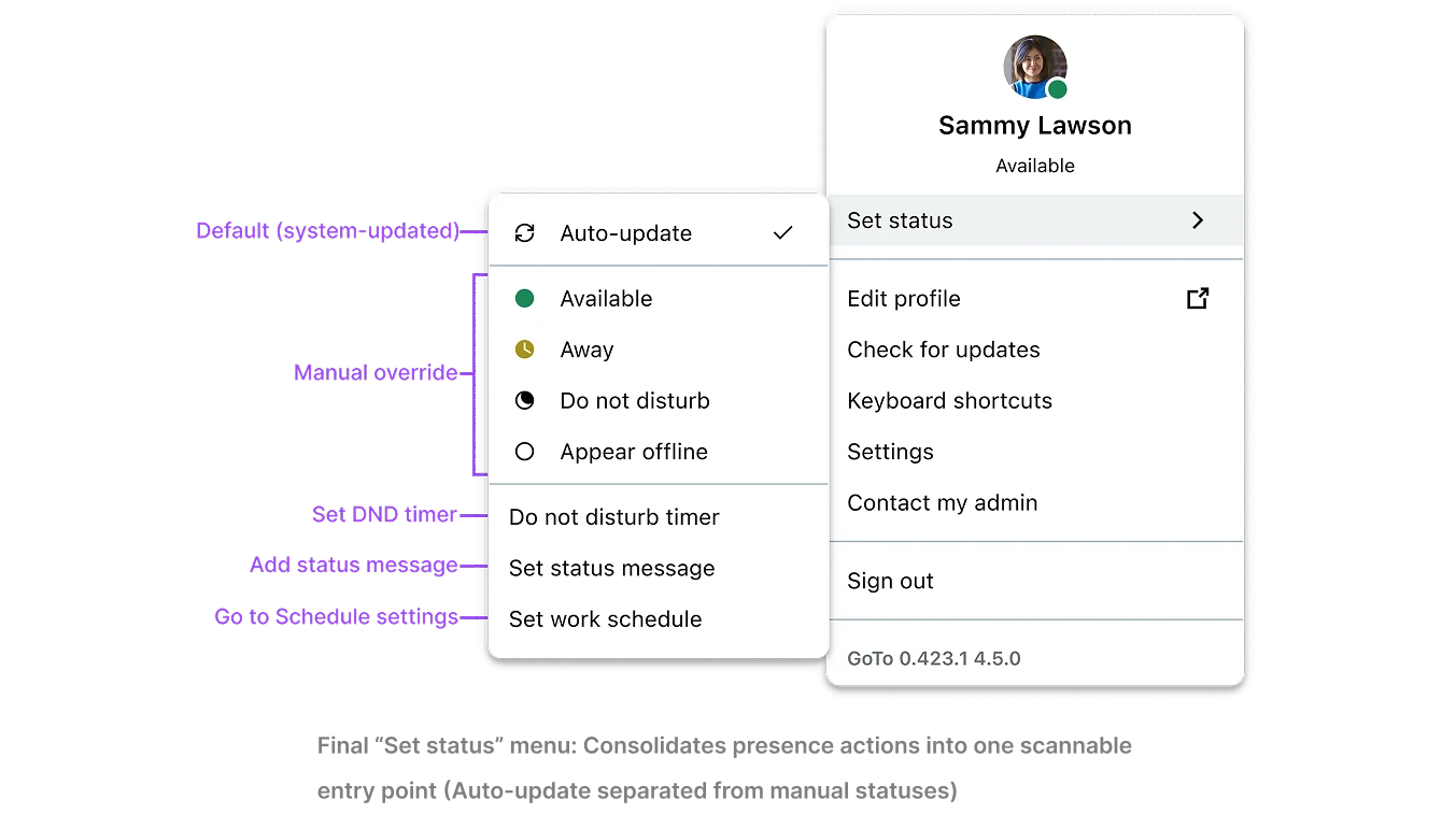
- Reduces menu clutter by grouping related actions and makes Auto-update feel like the default “home” rather than just another item in a list.
DND timer setting via a focused flow
When users choose the timer option, they set a duration through a simple, contained interaction – no nested menus.
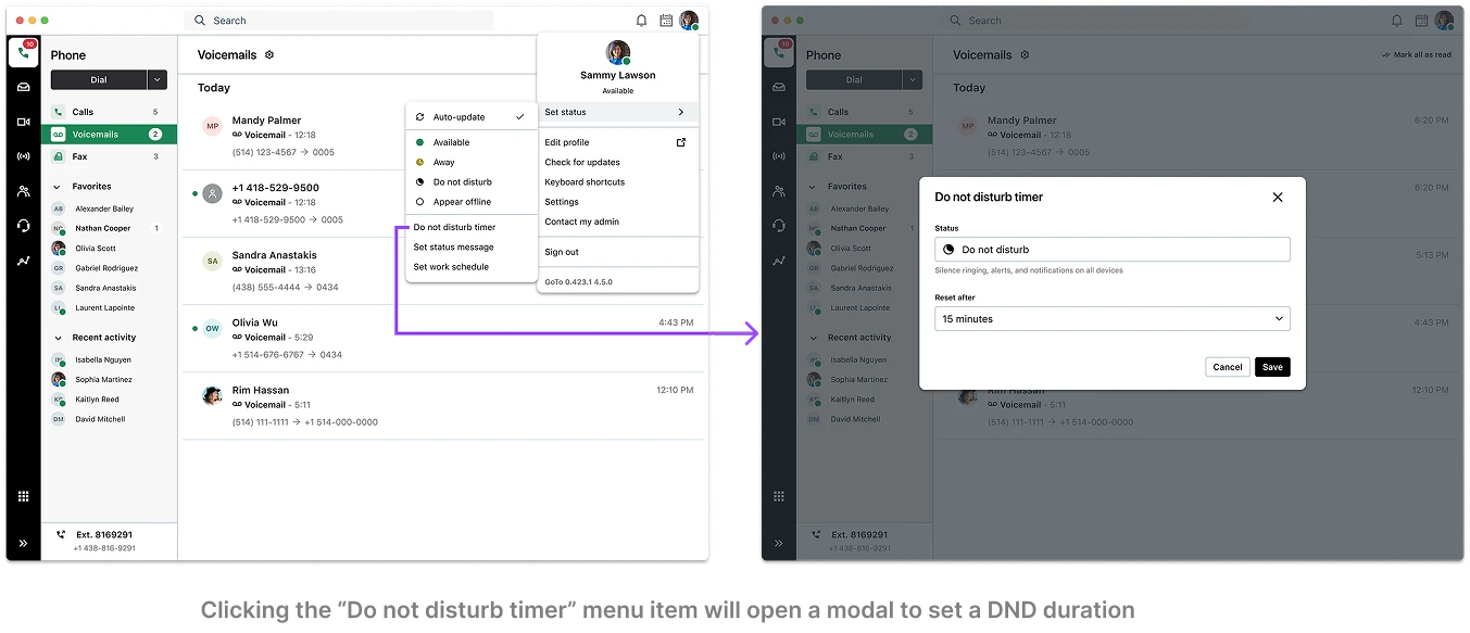
- Avoids the design-system limitation (no submenus) while keeping the timer action predictable and fast.
Timer information visible in menu (no hover required)
After saving, the status area shows the end time directly so users can confirm it at a glance.
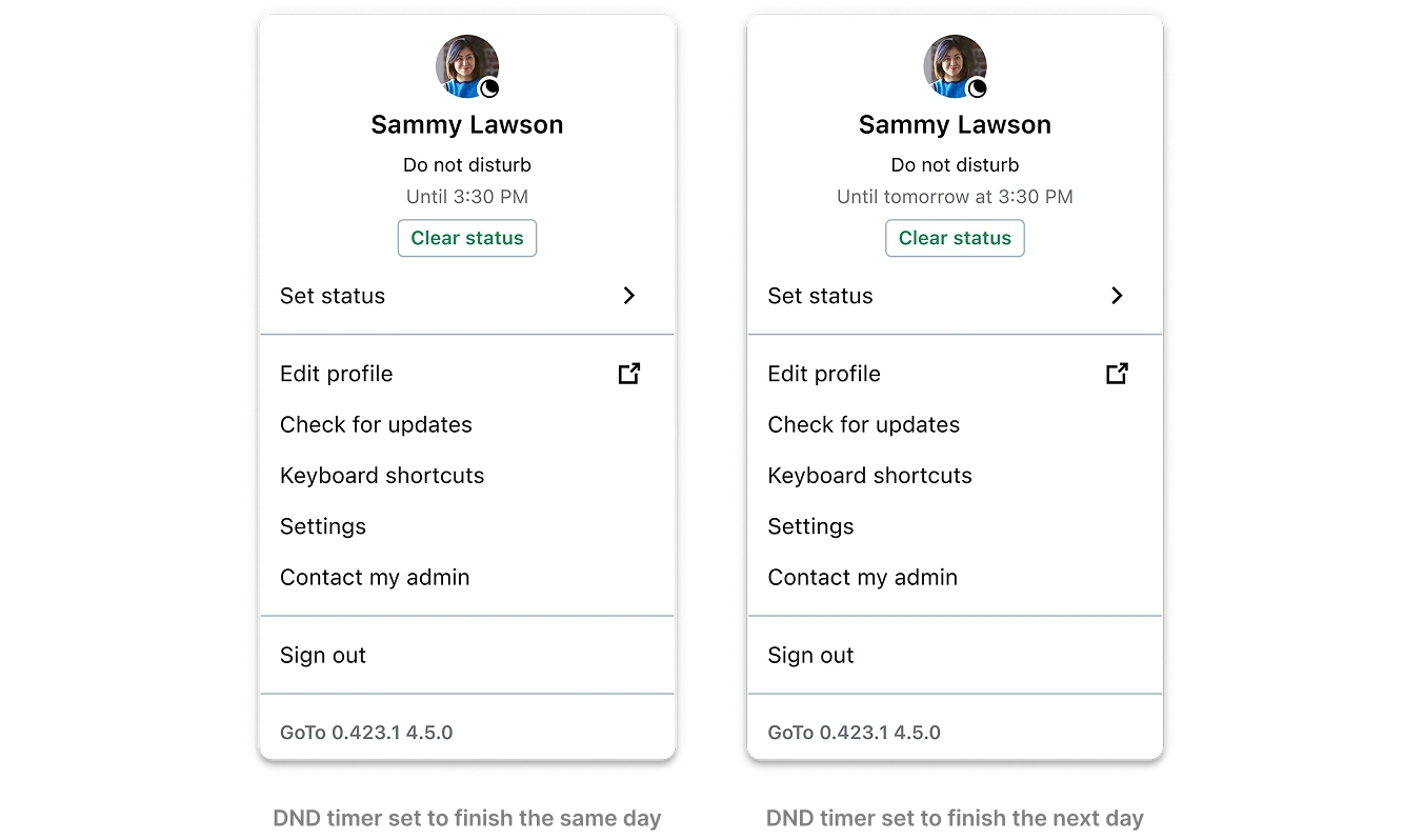
- Improves visibility of system status and reduces uncertainty - users don't need to guess whether the timer is active.
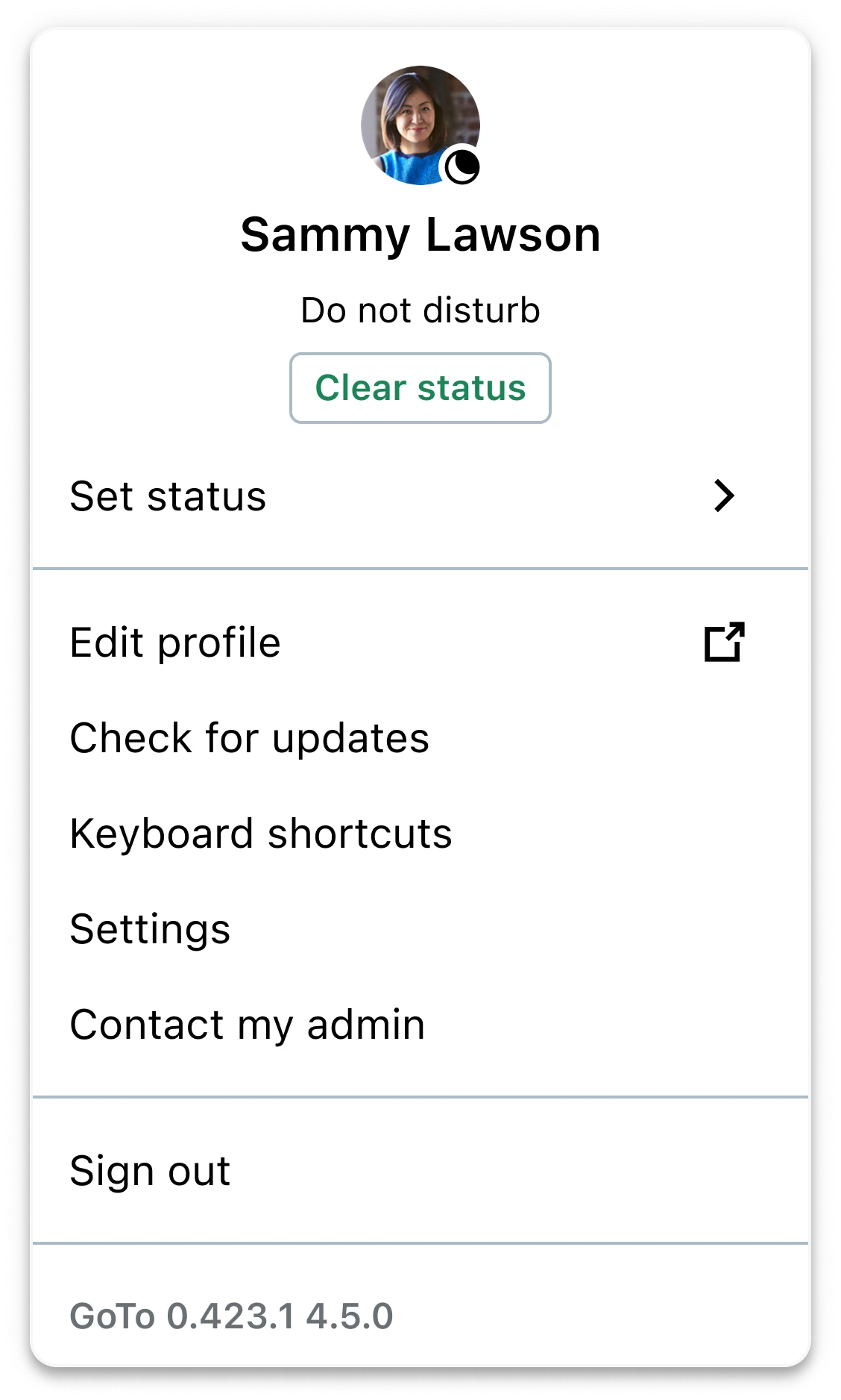
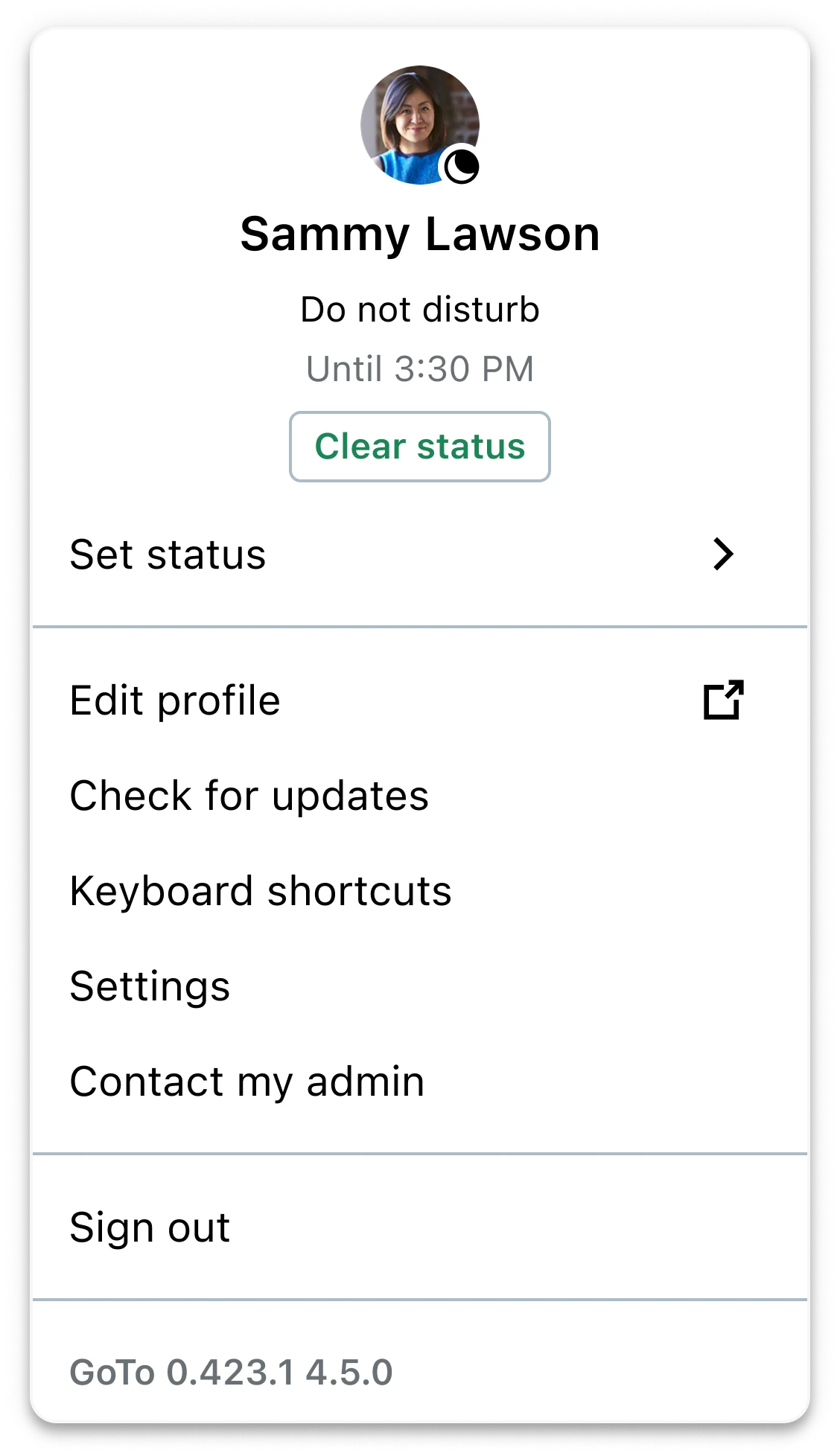
Clear status (Reset now) to return to Auto-update
When a user manually overrides their status, a contextual action (“Clear status” button) appears to return to Auto-update immediately.
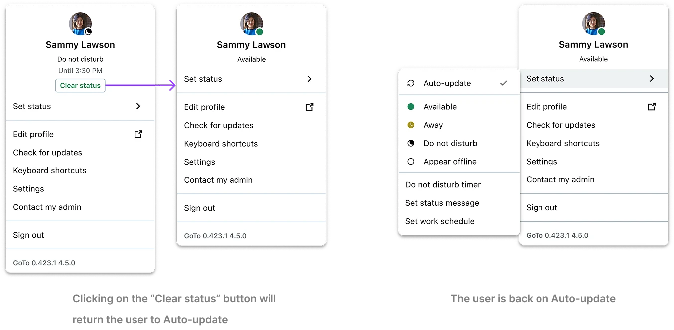
- Creates a habit cue at the right moment and supports the recovery pattern needed for Schedule: override → reset to Auto-update.
Different actions depending on what's driving the status
To avoid confusion, the UI distinguishes between three states:
MANUAL OVERRIDE
User chose it
→ Clear status
TIME-BASED DND
Timer chose it
→ Until + Clear status
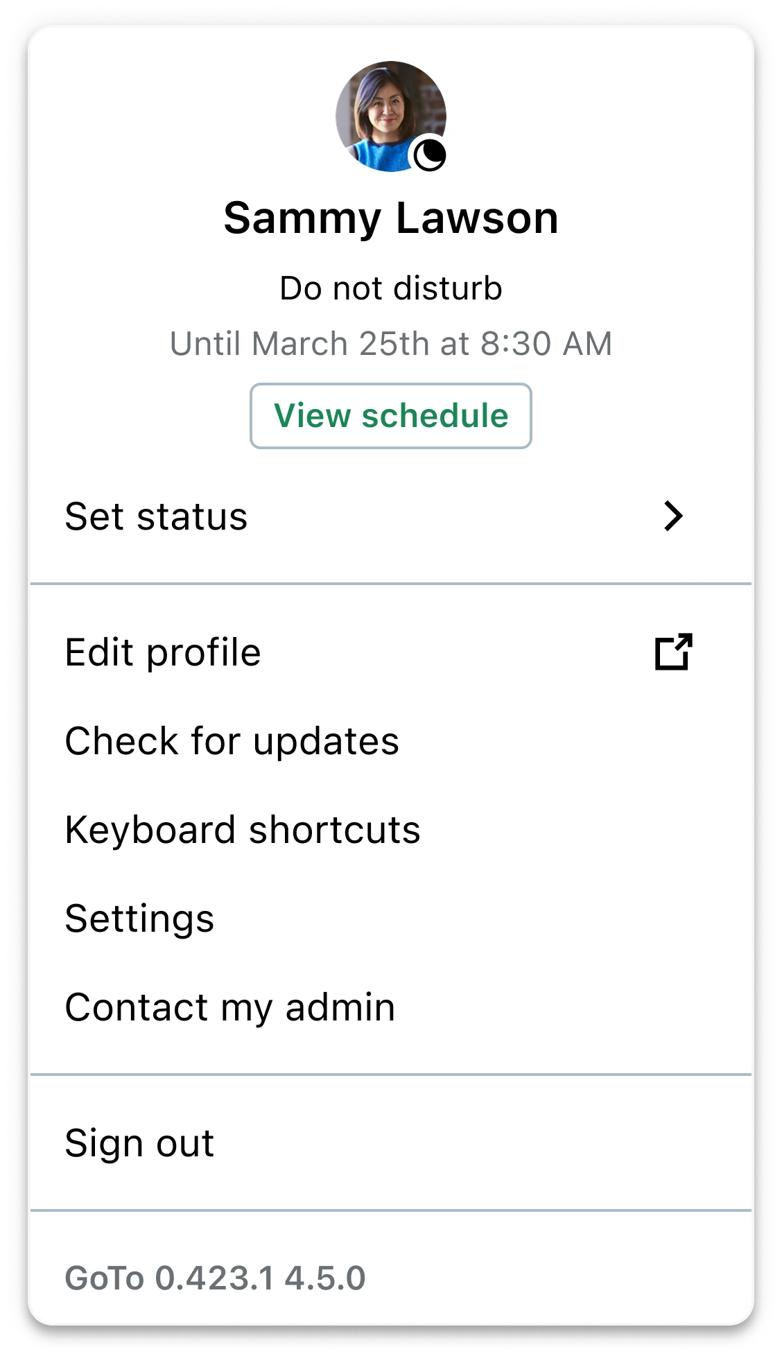
SCHEDULE-BASED DND
System chose it
→ Until + View schedule
MANUAL OVERRIDE
User chose it
→ Clear status
TIME-BASED DND
Timer chose it
→ Until + Clear status
SCHEDULE-BASED DND
System chose it
→ Until + View schedule
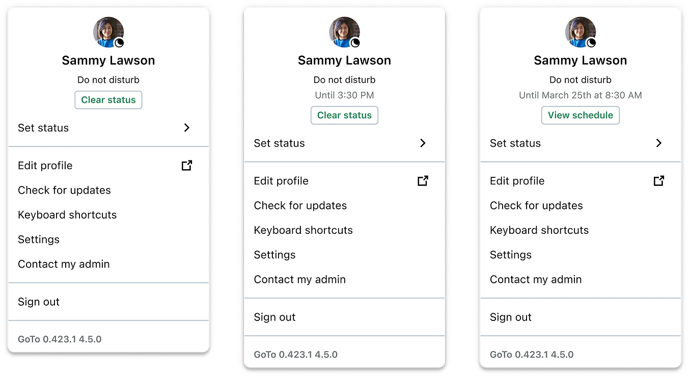
- Prevents users from feeling like the system is "fighting them" and makes it clear what they can control.
OUTCOMES & IMPACT
What changed after launch
North-star KPI: Return to Auto-update after a manual override (manual status set → user returns to Auto-update so the system can take over again).
BEHAVIOR LIFT
+11.6pp
+86% lift in users returning to Auto-update after manually overriding their status
SCALE
+2.3K
Additional unique users/month on average completing the “override → return” sequence, sustained post-launch
MECHANISM
1.6x
More likely to return via Clear status then by manually selecting Auto-update
PRODUCT IMPACT
Reduced the risk that Schedule fails silently by making "return to Auto-update" a fast, repeatable default behavior after manual overrides.
KEY LEARNINGS
What this project taught me
1
Designing for habits is different from designing for comprehension
Users understood what Auto-update meant, but they didn’t naturally return to it after setting a manual status. Behavior change often depends less on explanation and more on default pathways, prompts, and recovery patterns. In this project, making “return to Auto-update” an explicit, in-context action (Clear status) supported the habit loop without taking control away from the user.
2
Feature requests are a chance to re-evaluate the whole workflow, not just bolt on UI
The initial ask was a DND timer, but once I looked at how the presence system worked end-to-end (and how Schedule depended on Auto-update), it was clear a timer alone wouldn’t solve the bigger product risk. I learned to step back and treat new requirements as an opportunity to reframe scope around the user journey and system dependencies, then validate the solution with research instead of shipping an isolated add-on.